


namingBRAND IDENTITYstrategy, creative direction, logo design, and verbal landscape
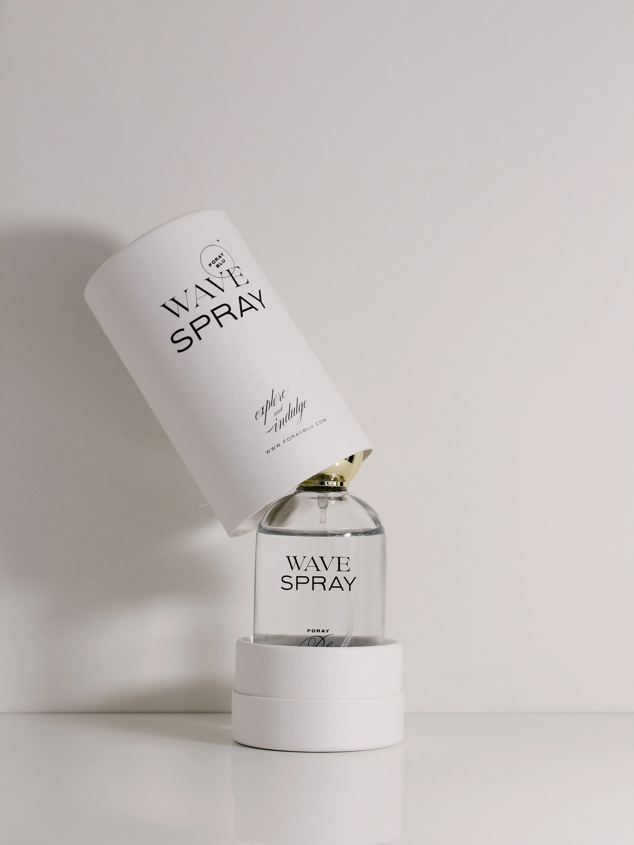
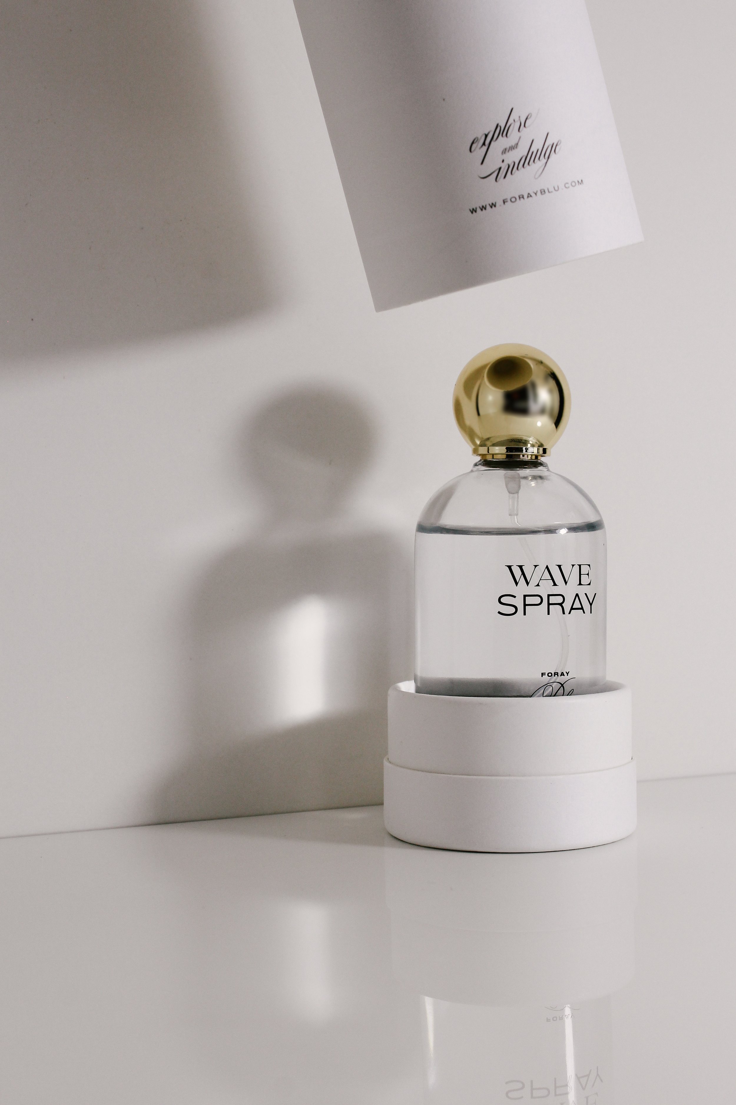
packaging designpackaging sourcing, label and secondary packaging design
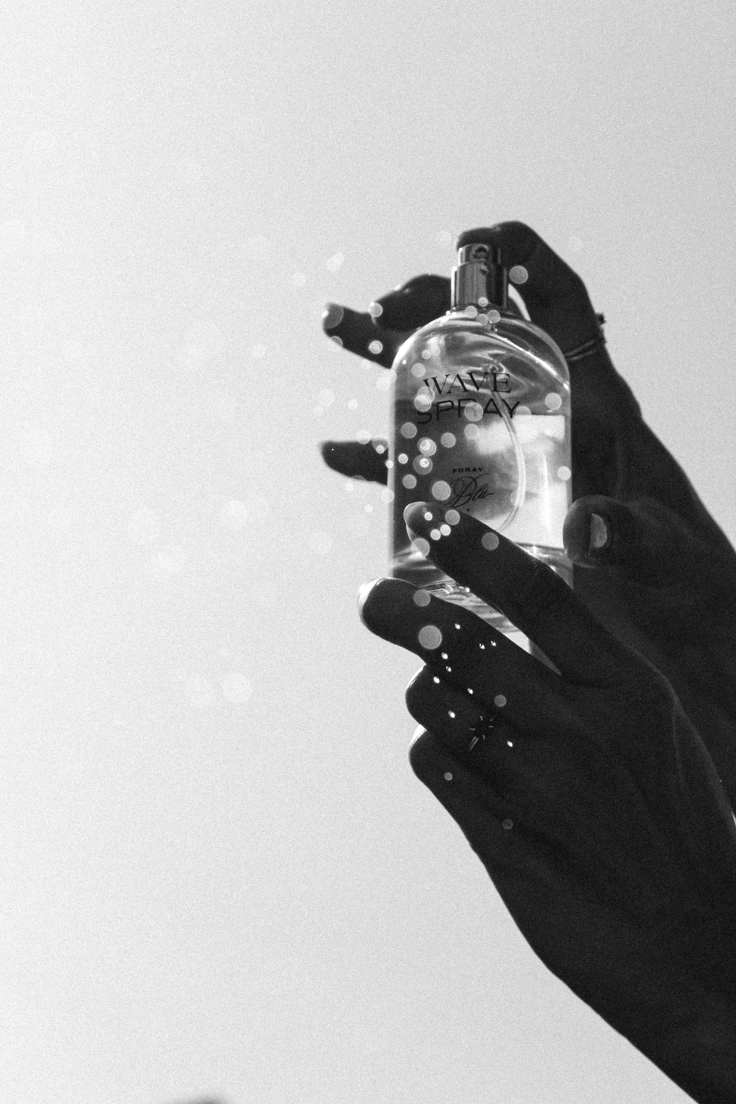
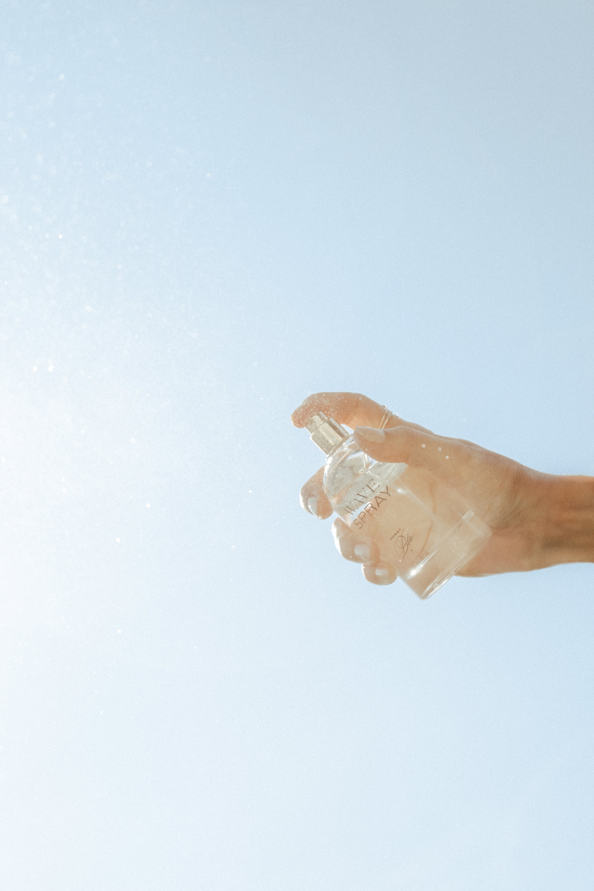
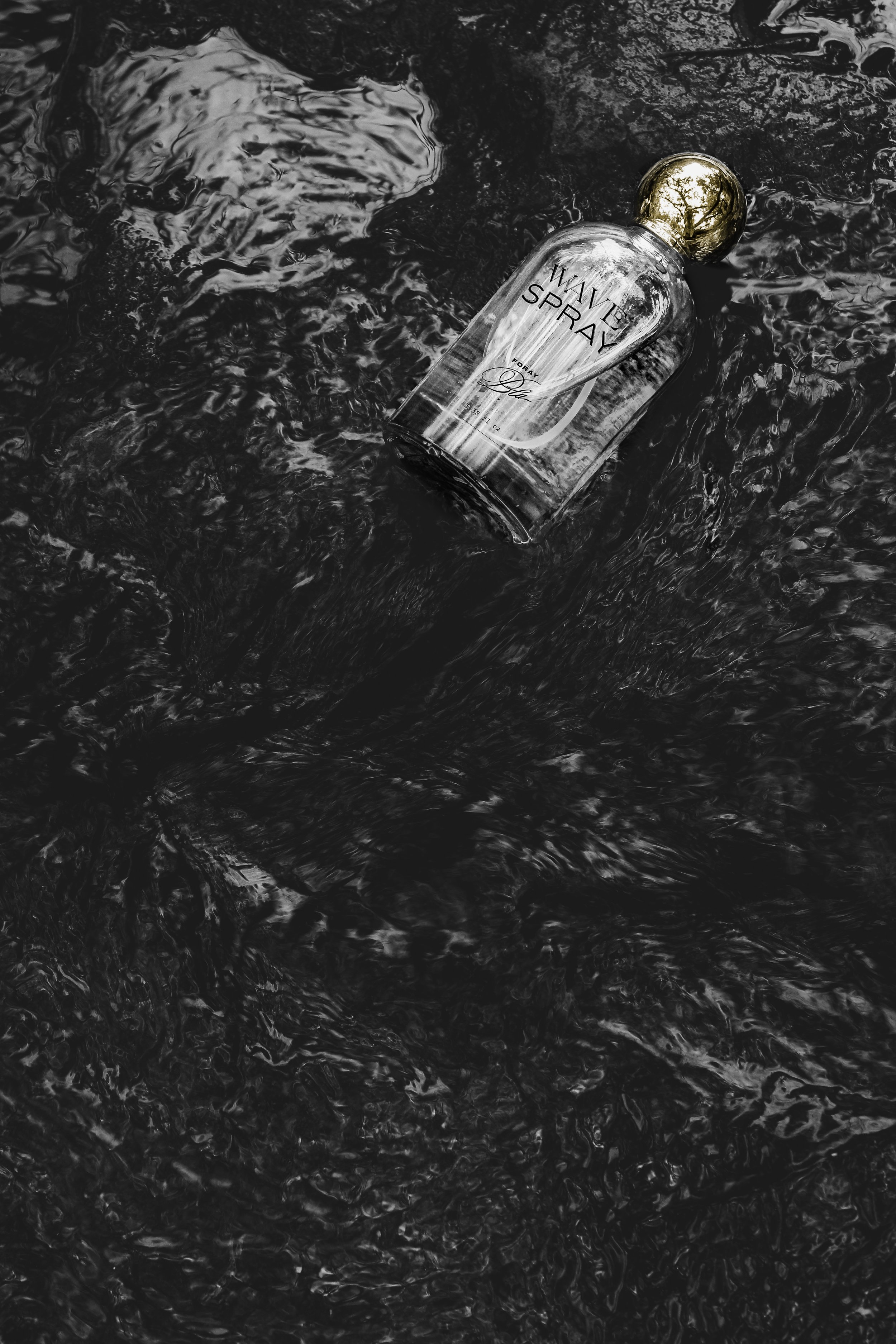
product photographyproject goal
Foray Blu founder, Brenna, reached out to the studio after feeling disappointed with the first round of brand design. She wanted something that felt luxe and soulful, yet spoke to freedom and adventure. She also wanted a brand that was powerful enough to launch with a single product, but flexible enough to launch new products in the future.
our solution
We started with a deep strategy session to identify the audience and key emotional connections. From the start, we felt that the previous name might not be the best fit. We decided on ‘Foray’ (foray (n): an initial and often tentative attempt to do something in a new or different field or area of activity ) and the Italian spelling of ‘Blu’. Together, they feel nostalgic, beachy, lush, and high-end.
Visually, we layered gritty typewriter text with high-end font styles to feel both grounded and editorial. Colors lean towards watery hues and washes of sunshine while photography aims to share a daydreaming quality.